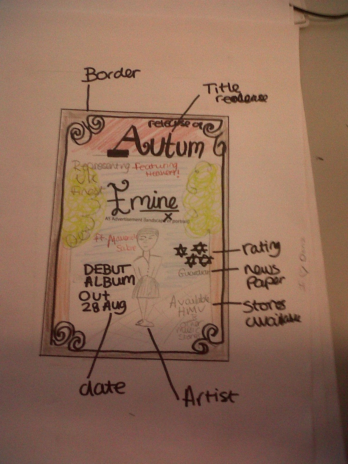
This is the poster mock up, I felt it was vital to include the artist I wanted a shot of the artist preferable centre, so the audience are drawn straight towards her, and I wanted to use a font which contrast to the background so it stands our, as you can see the background is pale whilst all text is vibrant, the important information such as the name of the album, the artist name and when it's release I felt was vital to have in larger fonts in positions it is easily read, for example I placed the artist name as well as the Album name 'autumn' at the top, because naturally our eyes will read from top to bottom therefore established what it was and conveyed that information first. I felt included the same location as both the digipak and video would make sense.
No comments:
Post a Comment