How did you use media technologies in the construction and research, planning and evaluation stages?
Hardware:
JVC GY-HM100 I'm really grateful that we were able to use the brand new state of the art video cameras. This camera could achieve an incredible quality of footage, as well as a good light/colour balance. They gave us the ability to use professional equipment, which lets you learn skills needed in the media profession, for example the camera lets you manually focus as well as auto focusing. It had many advanced features letting us change the way we want to film such as the about of light the camera takes in. I have seen other colleges use flip HD cameras which are nothing compared to these. We were given 3 memory cards, 2 of which were 16GB which surprisingly filled up very quickly. Fortunately, we could delete footage directly from the camera which helped a lot. The final memory card was for our camera to take pictures, and flip hd which we could use to video/photograph us filming with our proper video camera. This allowed us to document our progress and also take photos of our locations. Spot lights were very useful, although we didn't really need them as we wanted to film during the day. Our battery was very easy to put in and we were given a spare, just in case one ran out.
Although a tripod is not classed as technology it is a very useful piece of equipment. We didn't need to use it much as we thought a music video shouldn't be static.
Internet for research purposes:
Throughout we looked to the internet for inspiration and research as this technology gives us a wide variety of information. I googled my artist to find her website as well as going on images to find out a bit more about her style and image.
Youtube is one of the most important technologies we had access to during research and planning, as without it we wouldn't have been able to see the original video, or even got ideas from other videos. The suggestion bar on the left hand side of youtube is useful to link to other videos of the same genre and helped us get more ideas.
As well as social networking sites such as Twitter and Facebook, Wikipedia was a great help in researching our artist's and getting inspiration from webpages pages, to look at their style and compare them. I also found looking at the artist's direct pages to see what influenced them, how they presented themselves and how they portrayed their image to their fans.
Blogger allowed me to update my progression and help store helpful information and make it more accessible and overall was very helpful to doing coursework. Being accessible from a mobile phone it was very useful and i could even look at the blogging checklist and previous student work.
Software:
Final Cut Pro was an exciting video editing software to use, as it had many features which helped you add effects, transitions, change the video contrast, brightness and overall colour. I particularly liked learning this software. Below is an example of how we used this to change the video footage to our desired effect.
Original footage (LEFT) - Edited footage (RIGHT)
Original footage (LEFT) - Edited footage (RIGHT)
Video Filter. This is where you change the settings of the effects to give more contrast, less contrast, deeper sharpen, thinner sharpen or focus.
I edited to the beat using the markers you can see below, so it was in synch and on time and I used jump cuts edited to the beat to make it enjoyable and effective to watch.
Adobe Photoshop Elements was the key technology software we used to edit/make our images for our ancillary products. Without the use of this program i don't know how i would have done it.
As you can see from the Before and After pictures above, I used the magic wand tool to cut out the artist Eminé from her background. This image was used for my front cover, with a little help from Photoshop's colour and contrast tools I managed to achieve the black/white/grey effect I was looking for.
How effective is the combination of your main product (video) and ancillary texts (digipak and advertisement)?
The video I made with the group plus the advertisement and digipak work very well together as they compliment each other and have clear visual links.
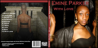
My audience can easily recognise the font and colour of the text on my advertisement as Eminé Parker's name is the same on the front cover of my digipak. I used the same colour scheme, white and bright pink writing, as well as a dark black/grey theme for the background. This placed more emphasis on the artist's name which dominates.
The photographic image of the artist is stylish and has a darker moody look similar to other albums I saw during my research. Whilst making my ancillary products, I focused on what I thought people liked and got lots of feedback from my friends. I asked people what they thought about my font and overall I got very positive feedback, so I am happy with the font I chose.
My advertisement photo was taken in Abney Park Cemetery, the same place where part of my video was shot. I also took other pictures there because I wanted the audience to see a clear visual link between my digipak and music video.Using the same stylish trendy theme, the artist is wearing similar clothes in the ad and the video. An iconic cross is visible above Eminé in the advert linking to the iconic symbolism of the video.
As you can see from the images below, the same location is used for my advertisement as well as a shot from my video.
We decided to show the artist's face very clearly as a link throughout the products. As she's a new artist, this was very important to draw attention to and advertise her face as well as her name, so that people could connect the two. Throughout the music video we used many close-ups to give her a stronger clearer image.
If it was up to me I would have shot part of this video at night, but it would have been challenging because of lighting and also getting the group to agree to this idea. I am very happy with the outcome of my video, but that is the only thing i would have changed as the darkness would have given everything a more edgy look and would have made an even better visual reference between my media products.
I think my target audience would be very attracted to my products as everyone who has seen them has liked them and given me very positive feedback. I believe as well as targeting people in my age group, that my media product could be universal, as all age groups seem to like it. I really enjoyed making them.
In what ways does your media product use, develop or challenge forms and conventions of real media products?
Influences
* Lana Del Rey - 'Video games' * Maverick Sabre - 'Something'
* Rihanna - 'Run this world'
* Yasmin - 'Light up the world'
* Emeli Sande - 'Heaven' * Delilah - 'Go'
* Ace of base - 'All that she wants'
* Madonna - 'Like a prayer'
* Unfinished sympathy - 'Massive attack'
* Kanye West - 'Jesus walks'
Mise en scene
Because the single 'Heaven' has a stereotypical religious theme, it was difficult for many reasons to diffuse the concept from having a thread of religion in it. The original video performed by the artist Emeli Sande had a perfect scenery choice, so we set out to imitate that a little. We shot some shots at the Abney park Cemetary where Emeli also got permission to film inside a cage like place. In the original video Emeli does not make it obviously seen that she is in Abney Park however, with research we as a group found out that was where she shot an aspect of the video. With this understanding we went down to the park and established full shots of the cemetry's surrounding. The location and setting inspired us and this is something that we wanted to incorporate in our video.
Another aspect of mise en scene were the religious iconograpy. This was also used in the original video, these included crosses, statues etc. The religious iconography element was also inspired by what I saw crop up in Madonna's 'like a prayer' video and Kanye's video for 'Jesus walks'.
Religious iconography from our video
Christ holding onto the cross.
A crossed statue from the Cemetary in Abney Park.
From original video:
Christ on the cross, symbolising his crucifixion
Christ
Madonna's 'Like a prayer' video:
Roseary
An Image of god and his son from the heavens above.
Madonna is bowing down outside the gate crying for the attentions of god.
Outside of the church building.
The two statues are of God and Christ.
The man behind the gate is representing Christ
Here we clearly see Madonna wearing an cross necklace.
Here we see Madonna in the sky. This represents here being in heaven with an Angel.
The choir are singing the chorus to the tune 'Like a prayer', whilst at the same time Madonna is telling a story.
Kanye West's 'Jesus Walk':
Kanye putting on his jacket before the choir in a form that represents him acting as a priest/pastor.
Church choir.
Kanye as priest/pastor preaching to church congregation.
* Costume & Appearance
The established artist 'Emine Parker' was to be introduced to the music industry as an fashion icon (not a Lady Gaga but an artist), that had a style that represented elegance and inspiration from the style icon Audrey Hepburn. This style was also very much used fully in the ancillary product. In the music video I do take a lot of inspiration from the original artist Emeli Sande with what she wore in the original video, Rihanna(the striped black & white video worn by Emine was also worn by Ri in her video of 'whats my name') and the London based edgy reto style.
This is the same jacket worn by Emine in the music video
The dark colours are also a theme that has been followed through in the whole video, with the exception of items that were purposely used to stand out like lipstick colour, shoes etc. In the centre is an image of London style icon Fearne Cotton in an edgy outfit
Editing process:
Special effects
The special effect that we wanted to use in our music video very much replicated a 1970's filmic style. However though, with this concept we wanted to repeat a musical motif. This musical motif followed the concept behind retro photographic images that are similar to the picture effect of the Iphones hipstamatic. The effect that I had in mind very much resembled an 'stained coffee effect'.
A video that had this 1970's filmic style was Lana Del Rey's 'Video games' video, Rihanna's 'Run this town' and also Ace of Base's 'All that she wants' video. All these videos also had an element of a rough suburban edge.
Rihanna ft Jayz & Kanye West - ' Run this town'
Lana Del Rey - 'Video games'
Ace of base - 'All that she wants'
Maverick Sabre - 'I need'
The re - occurring pattern in all four of these music videos are that the visuals seen in them are less of the glossy image we see in the stereotypical video today. There are hardly any scantily dressed women or men in them also.
Conventions of a music video:
How conventional is your digipak & advertisement?
(Text & Imagery)
For my digipak and advertisement I follow the convention for promoting an artist by using what I saw in other successful ancillary prints. I use close and mid shots of the artist so she can be easily identified.
1) Here is the image used for commercial rap artist Tinie Tempah's 'discovery' album . I'd say the mid shot imagery used as a cover can very much be compared to that of my album cover, reason being because my artist was replicating the famous iconic photo of 'Breakfast at Tiffany's' and due to this had some scenery in her image which is an concept that is plays a big part to her branding. This is the same as Tinie's, he is pictured clasping London in his hands. This is symbolic as Tinie is representing the City. The album title as well is called 'Discovery' which reflects on him being discovered within the big city. Emine Parker replicated the iconic 'Breakfast at Tiffany's' photo symbolising her elegance and style that the actress Audrey Hepburn is known for.
2) In terms of mise en scene both my ancillary prints were inspired by the positioning of the images of the iconic lady herself Audrey Hepburn. In my digipak I replicated the famous 'Breakfast at Tiffany's' image and also how the set was created to create that sense of elegance and class(to an specific extent).
Above is the similar images of the original 'Breakfast at Tiffany's and my own take of 'Breakfast at Emine's'.
Emine Parker VS Audrey Hepburn:
This is the first stage of my advertisement draft. My finished print looks a bit more professional and tidy. In this image I seeked out to show another side to Emine's character and persona. From her first single it s apparent that at this point in her careers she'd be talked about etc, so for my ancillary products I ensured that I used a variety of images and shots that showed her in numerous scenarios etc. Here she looks relaxed, calm and vulnerable, something that is absent in the video. The image above of Audrey Hepburn was a photo thatI studied so the level of vulnerability would be showcased in my magazine advert. Also you can see Audrey's beauty here as well, this is also shown in my image as well.
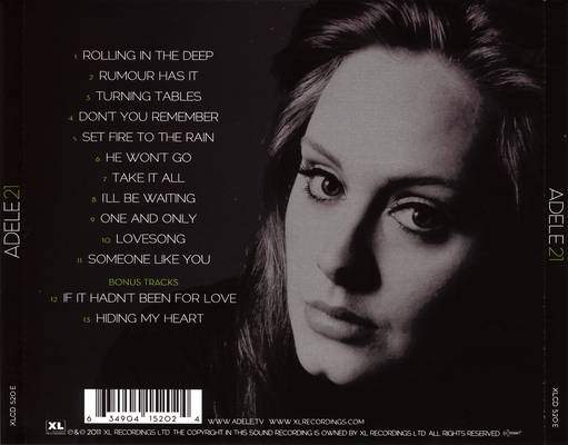
3) In terms of font and layout I also followed the conventions of a typical ancillary print product. For example I include the song titles at the back and I also have the artist's name in a bigger size so it stands out more than the album title itself.
In terms of how Adele's digipak is layed out you can see that the code of how to create a digipak has been successfully followed. The simplistic font(Abadi MT condensed light) used on my digipak reflects on how I want the artist to be portrayed; classy & elegant. I refused to used any kind of font that would distract the specific target and and potential album consumers. For the '21; album Adele also followed this concept.
In terms of following the stereotypical convention of an traditional album advert I did not. Above you can see that Adele's album advertisement used the same image that was used as her album cover, however though, i did not do this for mine as I wanted my artist's simplistic yet classy appearance/ style to be significant to her brand image. For my digipak cover I used an image that was inspired by Audrey Hepburn's 'Breakfast at Tiffany's' photo shoot and in my advert I used a different image, something that could be seen as showcasing a different emotion. An example of an artist who has also followed the same convention to not using the same image that was on their digipak is Plan B.
Here you can clearly see that Plan B has used a different image from what was used on his digipak. This could have been for the same reason as mine, but whatever the reason be I found this magazine ad quite useful when I was making the decision of using a different image.
Laura Mulvey's ideas on representation:
In relation to representation in music videos Laura Mulvey stated in 1992:
" In a world ordered by sexual imbalance, pleasure in looking has been split between active/male and passive/female. The determining male gaze projects its fantasy onto the female figure which is styled accordingly."
In the statement above Mulvey outlines the fact that today's outlook on life, especially in relation to the entertainment industry, there is an obvious divide between the male & female. The male is heralded into focusing on the 'curvaceous' woman who is purposefully made up for his viewing. The stereotypical representation of a woman in music videos today are based on Mulvey's outlook. Women are dressed provocatively for the man's attention. Good examples of this are the artists Shakira, Beyonce Knowles and Nicole Scherzinger etc. however though, representation itself is based on a variety of concepts. These concepts include gender, place, ethnicity, age, sexuality, class and so forth. In the first stages of an new artists introduction their appearance is closely considered. The consideration would've included a range of things, from the style of the artist's hair to the very specific choice of outfits. As artists ourselves, we then deconstruct this representation and interpret what we see into our own personal understanding. In this, we are then familiar with the forms and conventions of music videos for specific artists/bands.
Dizzee Rascal 'Holiday' - In this video their is a large scale of female dismemberment. Breasts, legs, bums etc, all that would entice the males attention.
Missy Elliot 'All N my grill' - Here is a different spin out on the female representation. The female rap artist Missy's persona of being a "female boss" is showcased before the viewer. There is a clear narrative of female empowerment against men(something that is very rarely seen in commercial music videos).
Here in my video I set out to challenge the way in which women I represented in music videos. I did not represent the artist Emine Parker in the style of the artist Missy Elliot as being a 'female boss' nor did I use the style that was adopted by the video girls in Dizzee Rascal's 'Holiday video. I tried to fill that gap without the artist having to conform to an steretypical convention. So therefore, I challenged the representation of how the female is showcased in a music video by representing her as an empowered individual. Compared to the two music video examples above i'd say that my video is not like any of them.
Goodwin's theory:
Goodwin stressed that"normal" narrative structure that were in films and books do not exist in the world of music videos. Goodwin also adopts the view of Todorov. One of the main reasons of this, is that music video directors choose not to follow the typical convention of noves and films as it restricts creative ability.
1) Pop vids are based on the concepts of songs( Occasionally do NOT follow the normal structure of problem then solution or happily ever after).
2) Pop vids tend to use the artist as the narrator or character
3) Often there is the approach of the artist looking straight at the camera(this enables the involvement of the viewer into the artists performance) . A great example of this is the artist Ed Sheeran's vid 'you need me...' In the video Ed is not present in the duration of the video and instead a sign language interpreter is used to perform the song in sign language. However though, before the song ends Ed appears revealing himself as the mastermind behind the song.
Pop videos rely a great deal on REPETITION. Very often these videos repeat shots in the visual style of how the choros and lines are repeated. The repetition of the song is tp enhance our familiarity with the artists specific style and genre. On many occasions this is done to expose the song and video to TV, radio and advertisements.
My video followed the convention of Goodwin's theory as there was no set traditional structure presented in the video. Out of the three forms named above I'd say that my video followed all three!
My video followed the concept of the song, teh artist was used as the character and narrative and also there were aspects of where the artist stared in the camera to allow that audience connection.
The TYPES OF RELATIONS in the production of a music video:
* Illustration - Where the video narrates the story of the song e.g Lil Wayne's 'How to love video does just this below
In the video above Lil Wayne narrates the story of his song as the actress performs the moral of the song.
* Amplification - Is when the video introduces new meanings that can also be associated with the song lyrics without contradicting it also. These meanings then also add in depth meaning.
An example of this is the artist Wretch 32's single 'Dont go'
Here Wretch adds deep context to his chart topping track.
* Disjuncture - Is where there is little connection to the song and video.
Above there is little conection or sense as to what the song 'one plus one' has to do with the bare skinned Beyonce Knowles.
In terms of the type of relation used in the production of my video I'd categorise my video as using the amplification structure. This because the video included a variety of meaning, hence the song was called 'heaven' it was hard to not have meaning associated. One aspect of the meaning associated in my video was the religious context that was used. for example the inclusion of religious statues and the cross bracelet I had on.
Vernalis's theory:
Carol Vernalis observed that in music videos edits are more frequent than what is seen in films. The edits used stand out as disjuncture and the edits that accompany them have an re-occurring rythmic base connected to the song.
She observed:
* The regular 'continuity' editing found in classic broadcast fiction is broken so our attention is on what is performed
* These edits are clearly seen by the viewer e.g wipe effects and special effects
* Jump cuts are usually always used
* A base track is normally used to give the video a smooth structure( for example it is much more easier for you to identify with the chorus when the visuals go to a specific bit)
* The camera moves in synch with the songs rhythm
In terms of Vernalis's theory I'd say that my music video did follow what she observed. We included base track that gave the video and visuals a smooth structure, we included special effect(the flash effect included to mirror the beats change in tempo), the camera was very much in synch with the songs rhythm and there was definitely NO regular continuity shots and the whole focus was based on the artist herself and her ancient like scenery. (Some of these points are also more specifically described above).