Showing posts with label Rebecca DeSantos. Show all posts

Sunday, 29 January 2012

Sign Off

A sign off to my A2 blogging experience.


Here's a little song for our goodbye :')


Evaluation4: Audience feedback2.

Myself and Ryan showed Mary the music video on vimeo and asked for her feedback.
Mary is a current media teacher, who has an eye for editing and conventions of a music video. Heres her feed back:

Evaluation4: Audience feedback.


Here is Shani's feedback to our Heaven music video, Shani is a fellow media student who can comment on the conventions and the technicality of the music video.

Saturday, 28 January 2012

Evaluation: Question4 Section one.


Audience Feedback

Audience feedback is the reception the products receive once distributed, yet also during the production stage to make improvements, feedback allows us/me to make improvements and evaluate my work without a bias approach. In the real world of media, once the music video is distributed the audience reaction and feedback is one of the most important things, after all whilst planning we had to consider a target audience and how we will attract them.

In order to receive feedback, we needed a distribution platform, for the product to be viewed upon. 
Ways audience viewed our product:

    Cinema- The cinema viewing is a traditional way of distributing footage, regarding feedback, the cinema viewing allowed us to recognise peoples natural reaction.


Vimeo- Is a site which allows you to share and view videos, this allowed us to upload a clear high quality footage, whilst asking for audience feedback this was used for the viewing as the quality was good and so the audience can feedback on the work at its best


YouTube- Youtube, is a population networking site, popularly used for viewing videos for free and sharing videos, most music artist are using this as a platform to distribute music videos, youtube allows you to comment and rate videos, therefore the interaction of the audience, creates a wide social buzz, a fan base and lets people listen to music freely.

Blogger- A blogging site, where we posted our final product whilst receiving audience feedback blogger allowed me to easily direct people to our post so they can view and comment.


After creating the music video we were given the opportunity to receive audience feedback from the showing at the local cinema 'Screen on the green'. After watching my music video being screened, I paid close attention to the audience feedback after the showing, the initial reaction was upbeat, the whole audience clapped and throughout the footage being screen, there were a few 'woo's'. Therefore from the overall reception of the audience, I felt the music video was a success, I heard no boo's the room sounded quite lively which suggested they were impressed. 


To get a greater knowledge on what people thought of the music video I asked a few people questions on what they thought, I recorded brief quotes from different peoples reactions. I recorded some of the comments:


'I liked how use an effect which made it more vibrant, that made it unique compared to the others'


'Rosetta really got into character, it looked like she took her role seriously and it showed on camera'


'I thought the different locations you's used were really nice'


'The music suited the mis en scene, I noticed the bracelet you used was had a cross, so it was religious like the song, shows you thought it through'


Having other media students give feedback, was good because they were able to identify the technical aspects and the conventions of music video and give a more insightful feedback which allows us to make improvements on our technicality and planning. Although their feedback was highly appreciated I also felt, it would be interesting to see what people who don't study media think, to get a more general reaction, therefore I asked a friend to comment on the music video, I directed them to blogger through BB (a smart phone) once viewing it they gave me their feedback.


I done the following process for the ancillary work, although in lesson I was constantly getting feedback from fellow class mates and teachers, which helped me create my final ancillary work. Once creating my final product I asked what people what there opinion was, this helped me see my work with the insight of others.


Ancillary Feedback:


Tahmids feedback was appreciated, he also studies media therefore he is aware of the conventions of a digipak. I was pleased with this feedback and considered how I could have used a different colour text. 


Jermaine doesn't study media yet being a member of the public he is used to seeing different advertisement, the fact he thought it looked real made me feel like I achieved my aim.

Overall Compliments and Critiques.

Compliments: Whilst receiving  most of the good comments complimented our artist, performance, the mis en scene/ change of costumes, the location range, the use of effects on the footage.

Criticism: To learn what to improve on we had to take the teachers/students criticism, most of the criticisms included, having more variety of close ups, shortening some of the shots, not using random edits once. 


What I learned from feedback.

The audience feedback helped me acknowledge aspects that I dismissed as I'd became too familiar with my work, getting different peoples opinions guided me to evaluate my work and the changes I could have made to improve it, for example during the music video Annabel mentioned we could have included more close ups, therefore if I had to refilm the music video, I would have took this into consideration. The audience feedback from the cinema, I was pleased with I felt we had made a video that appeared pretty professional and people acknowledge the thought we put into planning. The ancillary work feedback during lesson time, helped alot for example initially I forgot to insert the coding on the spine, yet whilst asking for someones opinion they brought to my attention I missed a convention, feedback is apart of learning and improving, I took the suggestions well, and appreciated them.


Question3 Evaluation


Jvc- A professional camera, which allows you to record high quality footage.


Youtube- A social site, where you can distribute videos, watch videos, also a platform for advertisement.

PhotoShopPro- A professional image editing software, allows you to manipulate pictures with a range of effects and editing tools, e.g. blemish remover.

Memory Card- A storing device, which allows you to transfer information on to a computer.

Apple Mac- Professional computer, with top range software, allows you to screen grab, and function quickly and efficiently.

Blogger- Online blogging sites, allows you to post a range of options from pictures, videos, links and text.


Quicktime- A software which transports footage into Mp4s like wise to hand break.


Evaluation Question2


Likewise to the music video, you can tell the artist put a lot of effort in to her style, the music video has a variety of costumes as does the photos from the ancillary photo shoot.

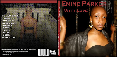
As you can see in the Digipak above the close up shot of her face is the exact shot used in the music video. 


The back of the Digipak uses a shot if her back, this is also done in the music video.


Example of the same location in the music video, and the unedited picture of the artist back for the ancillary.

Monday, 16 January 2012

Ancillary: Poster Production.


Creating the poster after completing the digipak, I planned to maintain a relationship, hence something which connected both of the products. Therefore I used the same font and colour, on the poster to the digipak, therefore you can identify the artist signature font style. I also used the same locations for each photo, this connects the digpak to the poster as well as the music video, the artist image upkeeps the East London, Shoreditch fashion. Whilst deciding my placement of font I contrast it against the dark colour as the fonts more vibrant, as well as positioning it at the top on the left as people naturally read top to bottom and left to right.


The poster is all about distributing and bringing acknowledgement to the audience, where they can buy the product as well as promoting the artist. I had to consider the branches where the product would be available, therefore I put the famous logos, 'HMV' and 'iTunes', the audience is able to identify with these brands as well as being informed where they can buy the product. I also acknowledge other ways of gaining a wider fan base for this new artist, hence I included a included her personal social networking website on 'facebook' where fans could get more information and closer to the artist; also her personal site for the same reasons as well as making the poster look more offical.


Conventions of the poster include, inserting the details when its out, what/who it is and where to get it, I included all these details, and I felt I placed them in ideal places and used appropriate comprehendible font. 

Friday, 13 January 2012

Ancillary Production:Digipak


Whilst creating the digipak I used the software I was newly introduced to Photoshop pro, I found the production of the digipak a game of trial and error, although I had an original plan, once the ideas were visually created on photoshop I decided it didn't look as impressive as I had intended, the main changed I made was the colour scheme, I felt the autumn colour palette should change to a subtle feminine colour, therefore I decided to go with a pink/redish tone.


During this session I experimented with the CD and the design I were to have, originally I put only the name, then I decided to have a picture of my artist yet I didn't want it to distract the picture left side, I thought to make the CD a little more personal to the artist her picture would be perfect. To do this originally I used a circle shape as you can see in the picture above 'Shape 8', I used the cut button to make a circle in the centre, this was the base of the CD and to get the artist on top, I simply cropped a picture of the artist into a circle shape the same size as 'Shape 8' then placed it on top, I had to make sure the layer was above 'Shape 8' then I faded the picture, this was it wasn't completely oblique, and looked subtle, I then put the album name and faded it slightly to maintain its subtleness.

To create the back of the digipak I used a photo I planned in the ancillary photo-shoot, the picture is of the back f the artist, in the location we shot the music video. I felt using a pictures which were taken in the same location as the music video was appropriate, as this artist is upcoming so people will be able to identify this digipak with the new released music video. I decided to use a close up of my artist on the front cover although this is simple, I felt it was the best way to focus on the artist, familiarising her 'new' face to the public. Whilst putting this picture on the front, I edited the picture in Photoshop, by adding more light, putting more contrast, I also blurred the edge and then used the blemish remover tool, to get rid of dark patches and overly shiny parts of her skin. 
I followed the conventions of a digipak, by included the details of the producers, copy right, artist name, record label, and date made. I placed them in the typical place these details would be placed, this made my digipak appear more professional and realistic. The spine had to include the coding which is found on cd's and also the name of the artist and the album name


I chose to use a font which contrast with dark background; I placed the font here carefully as the audience eyes will be drawn towards the bright font at the top, whilst creating this product my main intention was clarity and relevance, the font doesn't favour any other genres, it suits my artist character, and I was careful whilst planning font size and colours, in order for people to be able to comprehend the information without difficulty. The back image I faded whilst adding a mosaic effect, the reason for fading the image darker was to make sure when I added a lighter font it stood out, the background has a black tone to it, so I added a white font for  juxtaposition, the shades black and white are opposite hence I knew it was the best colour to contrast and stand out.