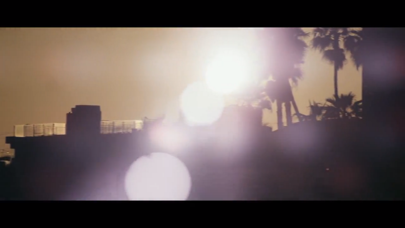
THE VIDEO BELOW SHOWS HOW THE MUSIC VIDEO IS MEANT TO LOOK. CERTAIN EDITS UNFORTUNATELY DIDNT WORK ONCE I PUT THE MUSIC VIDEO THROUGH STREAM CLIP. THE CLIPS THAT GO DARK IN THE BLOG MUISIC VIDEO AND THE VIDEO ON VIMEO ARE MEANT TO FLASH. THIS VIDEO SHOWS THIOSE CLIPS FLASHING. HOWEVER THEY ARE NOT FLASHING AT ORIGINAL RATE IN THE CLIP BECASUE AGAIN I HAD TO USE STREAMCLIP TO COMPRESS IT. THE FLASH IS A KEY PART OF THE EDIT! THE FACT THAT IT DIDNT WORK AFTER I PUT THE VIDEO THROUGH STREAMCLIP REALLY DISTRESSES ME WHICH IS WHY I AM SHOWING HOW IT IS SUPPOSE TO LOOK IN THIS SHORT CLIP.
another video that uses flashing like this: Beyonce ft. Lady Gaga - Video Phone - Similar to this music video I too edited my music video to the structure of the song itself.
The use of flicker and jump cuts structured to emphasise parts of the song.
The use of flicker and jump cuts structured around the structure of the song itself to emphasise certain beats and melodies.
Form & Conventions:
A typical convention of the genre is having different types of shots of the artist. This is a convention of Andrew Goodwin's theory that "the singer often looks directly at the camera - this is an extension of (music-hall) performance and trying to involve the viewer at home with the performance."
full body shot of the artist. - Eminé parker music video.
close up shot of the singer. this challenges conventions as she is not looking directly at the camera.
Long shot of the singer.
meets conventions of the genre as the singer looks DIRECTLY at the camera to engage the audience to the performance.
meets conventions of the genre as the singer looks DIRECTLY at the camera to engage the audience to the performance.
In what ways does your media product use, develop or challenge forms and conventions of real media products?
My media products
My media products conform to the ideas of a typical professional approach to the music industry. My video is shot with base tracks, jump cuts, repeat shots of the artist, camera moves with the music and our artist looks directly at the artist to create a connection and an involvement with the video.
My artists genre is R&B/Soul and for the original video i would say looking back to Andrew Goodwins ideas, that the original video was disjuncture(Disjuncture: This is where there is little connection between the lyrics and video or where the video contradicts the lyrics.). I think the song that I picked as a group worked best with this category. It follows the conventions of Vernalis's theory, using edits much more frequently than in a film, breaking this barrier allows us not to be distracted/bored, and our attention is focused on whats being performed on screen.
Base Tracks, Jump Cuts, Camera moves with music, repeat shots of artist, artist looks directly at camera to include audience.
I drew influences that helped me work on the Editing, mise en scene, camera work and motifs of my music video.
What videos was i influenced by and why:
INFLUENCES
Amy Winehouse - Back To Black
Lana Del Rey - 'Video games and 'Born to die'
Beyonce - 'Run this world'
Ambersuit 'Not Looking For Sympathy'
Emeli Sande - 'Heaven'
Yasmin light up the world
Rihanna - Cheers (Drink To That)
Kanye West - 'Jesus walks'
Mise en scene/iconography
I was influenced for our music video by looking at the Mise en scene of other videos. Our video is called Heaven so we wanted to make the settings nice and calm to reflect this. We used Abney Park cemetery and the outside of the church to create a religious imagery. Amy Winehouse made use of the cemetery and the exterior of the church in her video, 'Back To Black'. I really liked these religious symbols like crosses and gravestones in the cemetery and used them to our advantage in the video.
Regents Canal was another of our base-tracks adding a upbeat summery lighthearted feel good sense to our video. Ambersuit 'Not Looking For Sympathy' was set on Regents Canal and it added a really good feel to her video, but we made more use of the view and scenery.
Also, Lana Del Rey - 'Born To Die' is set in a church with a lot of religious icons, as well as the first version of Kanye West ' Jesus Walks', set in a church, while the other version shows a man carrying a cross.
Style/appearance: Our performer Emine Parker needed to be a fashion icon, who had a very modern up to date style, but also wasn't bursting out with colour or wearing something that wasn't suitable for the song, but at the same time still having a edgy look. We decided she was going to represent a elegant celebrity in modern trend wearing mainly black but adding something to brighten it up, such as lipstick and shoes. We took inspiration from our original artist Emeli Sande, while trying to steer away from her. She wore a striped white and black top which was very in at the moment, Rihanna wore it in her video 'Whats My Name'.
I believe we created a very good example of what a real artist would have worn and represented, having taken inspiration from artists in the now.
Effects and other influences we didn't get to put in.
As a group we wanted to add a old film effect to our music video and use the effect Emeli Sande used at the start of her video:
As well as this effect we wanted to have a constant retro feel, such as a old effect filter. It is used in such videos as Lana Del Rey 'Video game'
I wanted to make the video Heaven about humanity as a whole rather than separate religions. I wanted to originally do this by showing a very mixed ethnic selection together as one. For example in 'Love is my religion' by Ziggy Marley instead of showing lots of different religions, it points to the fact that love is the basis for them all.
I wanted to show a mixed variety of people coming down a estate block, with an occasional flash to angels. We didn't get the chance to do this, but i am happy anyway. An example of where i got this influence from is Natty - Badman, as he shows a variety of people mouthing his words.
For my Digipack I did my research and chose to go with a grey/black and white theme as it follows the conventions of real album covers, and I've seen many artists do for their albums. I thought for our artist it is very effective for an album cover, as she is a R&B/Soul singer.
This is my finished ancillary product, and i think compared to actual artists it compares very well and could be a real professionally made album.
As for my Advertisement, it replicates a real media form very well. The Artist name has the largest font size, promoting the debut artists name, the album cover is on there, a star rating by a magazine, when its out, where its available and what social networking platforms she's on.
Sam
Question 1
What i would like you to do is to start by thinking about the main forms and conventions of music videos - we analysed these ideas at the start of the unit. Think back to the early blogs on Vernallis and Goodwin and look at the laminates. What you are writing about at the moment are stylistic ideas that you've borrowed from real videos rather than examining the forms and conventions and then looking at how you use them. What you've got you can use but you must add to it.
Base Tracks, Jump Cuts, Camera moves with music, repeat shots of artist, artist looks directly at camera to include audience.
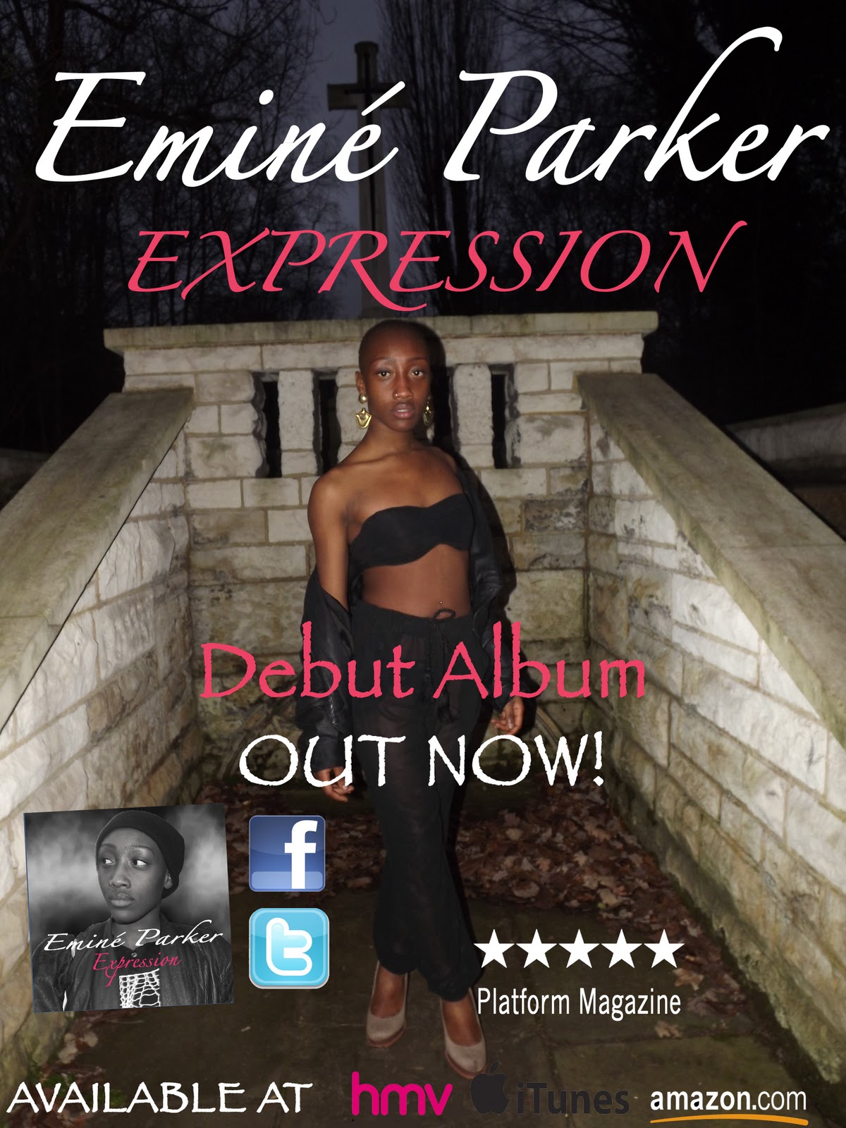
Creating the poster after completing the digipak, I planned to maintain a relationship, hence something which connected both of the products. Therefore I used the same font and colour, on the poster to the digipak, therefore you can identify the artist signature font style. I also used the same locations for each photo, this connects the digpak to the poster as well as the music video, the artist image upkeeps the East London, Shoreditch fashion. Whilst deciding my placement of font I contrast it against the dark colour as the fonts more vibrant, as well as positioning it at the top on the left as people naturally read top to bottom and left to right.
The poster is all about distributing and bringing acknowledgement to the audience, where they can buy the product as well as promoting the artist. I had to consider the branches where the product would be available, therefore I put the famous logos, 'HMV' and 'iTunes', the audience is able to identify with these brands as well as being informed where they can buy the product. I also acknowledge other ways of gaining a wider fan base for this new artist, hence I included a included her personal social networking website on 'facebook' where fans could get more information and closer to the artist; also her personal site for the same reasons as well as making the poster look more offical.
Conventions of the poster include, inserting the details when its out, what/who it is and where to get it, I included all these details, and I felt I placed them in ideal places and used appropriate comprehendible font.
Hello
You will need to display the photos from the cafe in a different format - they take up too much of the blog and don't contain any analysis/labels to say what they are. Upload to Photobucket or similar and embed as a slide-show.
Whilst creating the digipak I used the software I was newly introduced to Photoshop pro, I found the production of the digipak a game of trial and error, although I had an original plan, once the ideas were visually created on photoshop I decided it didn't look as impressive as I had intended, the main changed I made was the colour scheme, I felt the autumn colour palette should change to a subtle feminine colour, therefore I decided to go with a pink/redish tone.
During this session I experimented with the CD and the design I were to have, originally I put only the name, then I decided to have a picture of my artist yet I didn't want it to distract the picture left side, I thought to make the CD a little more personal to the artist her picture would be perfect. To do this originally I used a circle shape as you can see in the picture above 'Shape 8', I used the cut button to make a circle in the centre, this was the base of the CD and to get the artist on top, I simply cropped a picture of the artist into a circle shape the same size as 'Shape 8' then placed it on top, I had to make sure the layer was above 'Shape 8' then I faded the picture, this was it wasn't completely oblique, and looked subtle, I then put the album name and faded it slightly to maintain its subtleness.
To create the back of the digipak I used a photo I planned in the ancillary photo-shoot, the picture is of the back f the artist, in the location we shot the music video. I felt using a pictures which were taken in the same location as the music video was appropriate, as this artist is upcoming so people will be able to identify this digipak with the new released music video. I decided to use a close up of my artist on the front cover although this is simple, I felt it was the best way to focus on the artist, familiarising her 'new' face to the public. Whilst putting this picture on the front, I edited the picture in Photoshop, by adding more light, putting more contrast, I also blurred the edge and then used the blemish remover tool, to get rid of dark patches and overly shiny parts of her skin.
I followed the conventions of a digipak, by included the details of the producers, copy right, artist name, record label, and date made. I placed them in the typical place these details would be placed, this made my digipak appear more professional and realistic. The spine had to include the coding which is found on cd's and also the name of the artist and the album name
I chose to use a font which contrast with dark background; I placed the font here carefully as the audience eyes will be drawn towards the bright font at the top, whilst creating this product my main intention was clarity and relevance, the font doesn't favour any other genres, it suits my artist character, and I was careful whilst planning font size and colours, in order for people to be able to comprehend the information without difficulty. The back image I faded whilst adding a mosaic effect, the reason for fading the image darker was to make sure when I added a lighter font it stood out, the background has a black tone to it, so I added a white font for juxtaposition, the shades black and white are opposite hence I knew it was the best colour to contrast and stand out.




 To create the back of the digipak I used a photo I planned in the ancillary photo-shoot, the picture is of the back f the artist, in the location we shot the music video. I felt using a pictures which were taken in the same location as the music video was appropriate, as this artist is upcoming so people will be able to identify this digipak with the new released music video. I decided to use a close up of my artist on the front cover although this is simple, I felt it was the best way to focus on the artist, familiarising her 'new' face to the public. Whilst putting this picture on the front, I edited the picture in Photoshop, by adding more light, putting more contrast, I also blurred the edge and then used the blemish remover tool, to get rid of dark patches and overly shiny parts of her skin.
 I followed the conventions of a digipak, by included the details of the producers, copy right, artist name, record label, and date made. I placed them in the typical place these details would be placed, this made my digipak appear more professional and realistic. The spine had to include the coding which is found on cd's and also the name of the artist and the album name